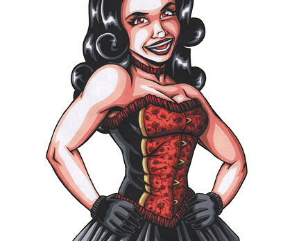
1. On a whim one day I decided to do a one-shot image of the black-haired dancer girl from my “If This Hat is Missing…” piece. At this point I didn’t think any further ahead than that. Uh, I mean it was only the first step in a grand artistic scheme. I’ll edit that first part out later.


2. After finishing the above image, I figured I might as well do images of all four of the girls.


3. While I was working on the girls, I thought about doing a background for them, which I drew separately and then composited together in Photoshop. On the left is the scanned drawing; on the right is the completed background in Photoshop.


4. Once all that was done, I decided to take it a step further and incorporate these portraits into actual show/carnival posters. Below is a rough sketch I made of my concept.

5. I sketched out the type and design elements by hand first. The names of the girls were all done by hand (left) and re-traced in Illustrator (right). The descriptive type was a font that I warped to fit the shape I laid out for it. Because each poster used the same design, I mixed the type up a bit by having the curve it follows alternate. When all the posters are placed next to each other in order, the names follow a nice wave design.


6. With both the main elements finished, the next step was to lay them out in InDesign. The border was a motif of simple vector shapes. After the design was complete, I exported a PDF and brought it into Photoshop to age and damage.

7a. I used the simplest tools in Photoshop to achieve the aging look – the brush tool was my main one, set on various hardness and opacities. I used some textures on some different blending modes to create the worn look.

7b. The folds were pretty simple to make – using light-to-dark gradients with crinkled edges, and further enhanced with some brown streaks for emphasis (as well as the corners). Brown blotches were also added to the edges.

7c. The folds were emphasized with white patches to give the impression of the ink having worn away after decades. Random patches were added to other parts of the image, including the edges. Along the edges (especially the corners and fold lines) I added some black in key areas to signify bits of the poster that have been gradually torn or disintegrated off. I also used a tiny brush to add dozens of tiny dots at the corners, as if the posters had been hung and re-hung with tacks and pins many times over.

8. This entire process was repeated three more times for each of the other girls’ posters. The folds and damaged effects were done from scratch each time to create a slightly different look.


