1. My ideas usually come as complete images in my head, with all the basics more or less in place. The idea for this piece popped into my head one day, and soon thereafter I jotted down the quick thumbnail on the right. None of the details were worked out in any real specificity, but the base was there. At this stage I thought it might be a strictly black-and-white piece, but that would change as I delved into it. I also did a quick sketch of the border and the elements that composed it (left). Again, not much detail there. After these sketches, months went by before I began to pursue it with any sustained motivation.

2. I had done this cover illustration for the Inland Empire Weekly a while back, in which their editor had asked me to make it visually similar to Mexican folk and Day of the Dead art. This was a pretty rushed job (done in a single night), and it looks pretty decent considering. I liked the sketchiness of the lines and the pattern of the background around the skeletons. I wanted to do something similar of much higher quality in the future. This project seemed to offer a chance to do that, so I had it in mind as I began.

3. As I started to think about the piece more and more, I began to flesh out the details of its subject, the Day of the Dead girl (“Muerta”). I liked the approach here, but her hair in a bun didn’t feel quite right. Below is a detailed study of the border, which was done later after I had already started on the full-size version.

4. I did a full ink drawing of the concept on an 8.5 x 11″ sheet of paper (close enough in proportion to the final). I don’t normally do comps to such a finalized state, but since this image had so many elements, I wanted to see how they all looked together. I solved the issue of what her hair would look like and laid out more basic elements. I still wasn’t sure how the background stuff would play out, so I scribbled them in without much thought.

5. This isn’t a great photo (screw you, sunlight!), but it shows the beginning of the final (about 20 x 26″).

6. It seemed prudent to finish the border before moving onto the interior of the image. I used only a basic fine-tipped Sharpie pen for speed and simplicity, and completing the border went by fairly quickly (about 2-3 hours). Sharpies are by no means precise drawing implements, but there’s a simplicity and immediacy that I enjoy.

7. Two progressive stages of the girl herself. I did some research into Mexican dresses, since I wanted something more authentic and better-looking than what I had done in the preliminary sketch.

8. At left is the (mostly) inked girl. It’s much easier to ink the foreground elements first before moving onto the background (right).

9. All the inks are done, including the final details on the lace patterns of her dress and the flowery facial paint. The creature on the bottom left in the background is a cicada, because they’re awesome (and weird-looking).

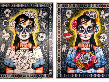
10. As I said, I had originally assumed this would be a straight black-and-white piece. But as I worked, I realized that Day of the Dead is about color. White skeletons and skulls may be the most recognizable elements of the holiday, but this imagery is contrasted by brightly-colored flowers and garb. This dichotomy between the starkness of death and the brightness of life is my favorite aspect of the holiday, and highlights a very different and interesting cultural attitude towards death I find refreshing.

11. The finished hand-colored piece. As much as I wanted to follow through with the multi-colored background of the IE Weekly cover, I realized that it wouldn’t work in this case. There is enough color elsewhere in the image, and to do the rainbow color scheme in the background would have been too much. By nature, an image’s color palette is restricted to just a handful of colors. When doing something that has nearly every color, it becomes a more careful task to apply those colors judiciously.

12. The final scanned and digitally-colored image. I overlaid some paper texture and did relatively few tweaks to the color (such as adding some color back to the girl’s white face and adjusting the tone of her skin). There’s usually more fiddling with the colors to achieve some measure of subtlety, but I liked the boldness and brightness of the colors, so the final is pretty close to the marker-colored version.
